California, US (BBN)-The 'Friends' icon on Facebook is seeing a subtle change, both on its website and apps.
It's a small icon, on the top right part of the screen and most of us probably never look at it at all, but Facebook Design Manager Caitlin Winner did, and noticed something.
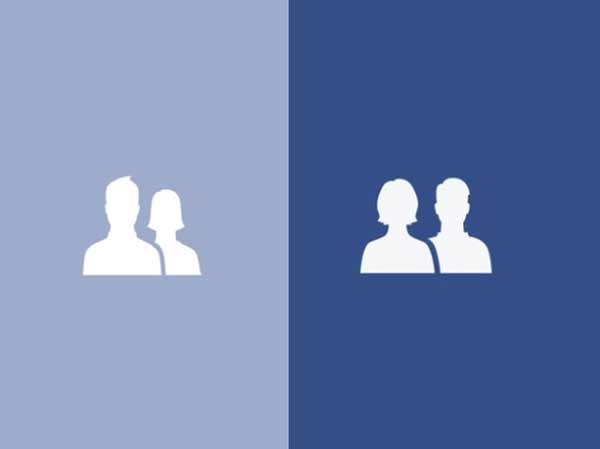
Winner was looking at the individual glyphs that are used in the icon, and noticed that while the male glyph has normal, rounded shoulders, the female glyph has a chip in it, reports NDTV.
This, she realised, was a marker for where the male glyph is placed in front of the female - combining the two forms the normal Friends icon - so the female glyph is always slightly smaller, and slightly behind the male silhouette when Facebook places them together, and when used separately, the woman always has a chip on her shoulder.
Winner decided to do something about it, and detailed the process in a post on Medium.
With that done, Winner decided to look at the size and placement of the female glyph in the friends icon. "As a woman, educated at a women's college, it was hard not to read into the symbolism of the current icon," wrote Winner.
"The woman was quite literally in the shadow of the man."
Winner experimented with a dozen different styles for the icon, but eventually couldn't make it look good without making the two icons slightly different sizes, or putting one in front.
Eventually, as a compromise, she decided to place the female glyph in the front, but kept it slightly smaller than the male glyph.
Winner writes that the project has her on high-alert for symbolism on the site, and says she will be keeping an eye out for any other icons that need to be changed.
This is not the first time that Facebook has made such a change either.
In August 2014, Facebook made a minor change to the globe "notifications" icon; the icon used to show the Americas inside the globe no matter where you are in the world, but today, if you look closely, you'll see that it shows the part of the world you are in.
This is a good example of a company giving its employees freedom to do something they felt is important, which might improve the experience for some people, without affecting those of us who never noticed the icon in the first place.
The changed icon appears to be rolling out gradually to users across the world, as some users are reporting not seeing the change.
BBN/SK/AD